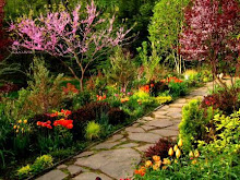
 My efforts at garden making, diverse though they may be, tend to rely largely on contrasting the shapes and textures of foliage. Flowers too (and how about those way cool dahlias and Lantana trfolia-a plant I am so hunting for next year.) And since, when it comes to gardening, I'm one of those more-is-better guys, I like dramatic juxtapositions of plants with wildly differing attributes. But on a recent whirl of garden visiting I had to admire an approach almost opposite to mine, an approach that often groups plants by their similarites rather than their differences, an approach that I find ethereal, airy--almost to the point of spectral, and oh-so appealing. Perhaps its allure lies in the likelihood that this is an effect I rarely strive for--with any measure of success--in my own gardens, because the truth is that I have utterly no idea how to go about achieving it, so...I'll just appreciate this vaguely impressionistic effect that to me uderscores a garden's fragility and its transitory beauty.
Take the opening image of Nicotiana mutablis, its pinky white flowers creating a starry firmament above the clouds provided by Euphorbia characias 'Glacier Blue' and Agastache 'Acapulco Salmon and Pink.' The scene looks fragile, almost ghostly, as if it might disappear in a gust of wind. But this vignette at the Ladies' Border at the New York Botanical Garden exhibits real staying power, it will provide that punch for weeks if not months. It's all about the massing of tiny details.
Likewise. on the other side of the NYBG conservatory, I happened upon the Seasonal Walk, this year a Dutch treat courtesy of uber-designers Piet Oudolf and Jacqueline Van der Kloet. Oudolf is known for the creation of evolving, seasoanlly rich plantscapes--many of whicxh are built upon the very frilly, linear shapes which so baffle me whenever I try to group them into combination. But there's no denying the windblown beauty of their creation, and the sheer eye-popping pizzaz of those dahlias nodding amid the plumes of grasses.
Farther afield, at Chanticleer, a similar scene revealed itself. And though horrid lighting prevented capturing a good representation of the tableau, there's no denying the effective use of lots and lots of linear shapes. The grasses, the yucca (is that a rostrata?), and the rest gathered in festive celebration of the airy line. That it works, no doubt. How the conceptual process that pulled it all together evolved, no clue.
Finally, this Chanticleer reverie really got me motivated to try some of these more impressionistic approaches to garden making. Foliage is doing nothing for this flowery fantasia, but the ethereal beauty of these colorful clouds-in primary hues of red, yellow and blue--make this something worth striving toward. And so I shall work next season, once again, to make my own scene that is more gauzy than gaudy, one that relies on likenesses rather than differences, one that is subtle, not shocking. Maybe I'll get lucky.


1 comment:
Eclectic stuff!
Post a Comment